Wednesday, January 30, 2008

Coloring with Danimation


I wanted to warm up today with some coloring but I didn't want to spend the time drawing anything. So looking over things I had in my pictures folder I ran across some Danimation drawings so I decided to color one of his pieces.

I only focused on the Sand-Man and let everything else fall to the background. I'm happy with the "sand" texture I got on his body. I used a slightly different method on this piece than my others and I think it worked out great!

Tuesday, January 29, 2008

Still drawing


I haven't drawn traditionally in a while and today I picked up a mechanical pencil to see what might happen. I'm actually pretty happy with what I came out with. I was trying to be more expressive with my characters faces. Well, back to animating.

Friday, January 25, 2008

Website update

Just wanted some opinions from the peanut gallery: Website

I think I'm going to put my name in readable text next to the new logo. And yes I'm aware I'm ripping off Apple :)

Wednesday, January 23, 2008

So that we are all on the same page

I'm going to be putting down the digi-pen for a bit to focus on my animations. I'm a bit behind. You can view my animation updates through my animation blog, the link is on the right. They wont update as quickly as my drawing stuff, but that's the way it goes.

Also, I'm working on my new website design which you can view here.

Monday, January 21, 2008

Add some color to your life.


This is the house with color.

It has begun! (cue Mortal Kombat theme music)


Started with the value painting this evening. I focused heavily on the exposed skin first because it needs to be the darkest value compared to his red clothing. So far I think its coming along swimmingly. I hid the line layer to see what it looked like and really dug it, so I decided to post that.

I'm excited to see how this one is going to look when I'm finished.

Sunday, January 20, 2008

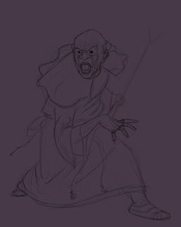
Drawing Finished(?)


Just wanted to post the finalized(?) drawing of the Vampire "Priest". Did some research on White-Wolf's vampire clans and such and there is a sect of priestly Vampires. So I found their symbol and incorporated it into the concept.

Hopefully I wont get into trouble.

Friday, January 18, 2008

More work stuff


One thing I've noticed is that my building designs lack any character. Even though its a building, it should have a little something. So I pushed this one a bit more and I really liked what I came out with.

Then I added the value underpainting.

I'm stupidly happy with this. Using the underpainting has really forced me to focus on what is lighter and darker, and pushing my lights and blacks a lot more. I'm super happy with this one. Not sure if I'm going to add color, or just leave it here.

What do you guys think?

I've been Vampirized!


Reworked the drawing a bit. At Bryan's suggestion I exaggerated the teeth more. I didn't like the folding on the cloth of the foremost arm so I reworked that, and finally fixed that foremost foot again.

So far I like the changes. I just need to do a few more thing and then I'm set to work on the underpainting.

P.S. I learned the value of the Pen Tool tonight.

Thursday, January 17, 2008

Fun with Photoshop


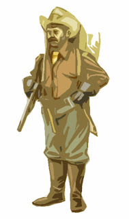
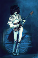
Put some more finishing touches on the Cowboy and then played around with photoshop and different effects on him. I included the ones I thought were cool/interesting. I also added the last guy because I thought it was pretty good.

Wednesday, January 16, 2008

Testing out the new techniques


So, I'm taking a break from the Vampire to work on this Cowboy using the new technique that I read over at William O'Connor's site (see below for more information on that). Its interesting to see how the process builds up slowly. I'm enjoying how the underpainting establishes tonal values quickly. Its easier to see now what needs to be changed to make different areas pop out more than others.

I still have a lot more detail to do. Adding textures into the canvas bag and hat. I'll update later, as I am tired now.

Tuesday, January 15, 2008

A break from my art: Introducing William (Bill) O'Connor

A friend turned me onto this artist William O'Connor the other day. His stuff is high fantasy; elves, soldiers, dragons, orc etc etc. Turns out he has even designed many of the concept art work for Dungeons and Dragons.

On top of his great gallery he has a page dedicated to showing his digital painting process. Having taken an oil painting class and doing other color studies, his process makes a ton of sense.

He first takes his sketch and color balances the lines to a sepia tone. Then, with another layer on top does on "Underpainting" to setup is tonal values throughout the piece.

I'm not going to go through the entire process, but I encourage you to head over to the demo page and check it out for yourself.

edit: Removed the images because I read his copyright information. Sorry Bill, I hope there are no hard feelings.

Saturday, January 12, 2008

Digital Painting 2


After talking with some friends and looking at how other people go about this kind of stuff I decided to take some photo-reference of myself in this pose. As you can see, I couldn't replicate the exact pose because it was inhumanly impossible to do so. Which I think works in my favor, because now this pose was more what I had in my head to begin with and looks more natural. Now that the character is nailed down, its time for some color.


Starting another one. This one was inspired by a black priest I saw on TV while watching the news. Thought him being a Vampire would be cool. I'll be working that left foot a lot in this one I imagine. Its just not right and I'm having a hard time figuring it out. Might need someone to pose for me on that one.

Friday, January 11, 2008

Digital Painting

Final? (tweak tweak)


Met with my buddy Vinnie last night and talked about his work at White-Wolf/CCP. After picking his brain about their character designs and such I decided to work on something that is more in their vein for a moment. So this is the beginning sketch of just a "normal" guy you might see walking down the streets of Chicago.

I'll keep adding edits to this post as I add more to it.

Wednesday, January 9, 2008

Character Development: Brick Bouser


Been working on a cartoon concept for a year or more now with a friend and I'm wanting to get back into the character design process for the show. I've drawn this particular character several times and I feel whatever style I land on with him will set the tone for the rest of the characters. He is one of the two main characters.

For this design I need a character that's full of mucles, and empty of brain. For the muscle I didn't want to go with an Arnold type body build, but more of a World's Strongest Man body type. Lots of muscle bu with a layer of fat there as well. No real definition. I've noticed that the stomach on these guys tends to stick out further than their chest, so thats something I need to push further I think. More to come.

Edit: Added the above pictures "Dueling Bricks" and a face study.

Wednesday, January 2, 2008

Work: Orthographic views of an Inn


After designing a lot of the different areas that will be in our game the next step is to begin modeling the houses. Our 3D modeler requested I do some more detailed drawings of the different views of all of the buildings. Here is one I finished up of an Inn that is out over the water.

All of the work images I post are copyrighted ISO Interactive, LLC.

Team Fortress Sketchup: Pyro


Been playing a lot of Team Fortress 2 and loving it. The entire design of the game was incredibly well thought out. I love the character designs and the artistic choices. With that in mind, I've decided to sketch up the 9 characters. I'm working on posing mostly. Trying to capture a lot of life and motion.

Here is the Pyro. One of my favorite classes. He's just a loony guy with a flamethrower. What more could you want?!

I decided to try something that Joe showed me and isolated an area and blurred out the areas that I didn't want the viewer to be as interested in. Its pretty cool. I think it would have worked better for this piece had it been in full color though.